Overview
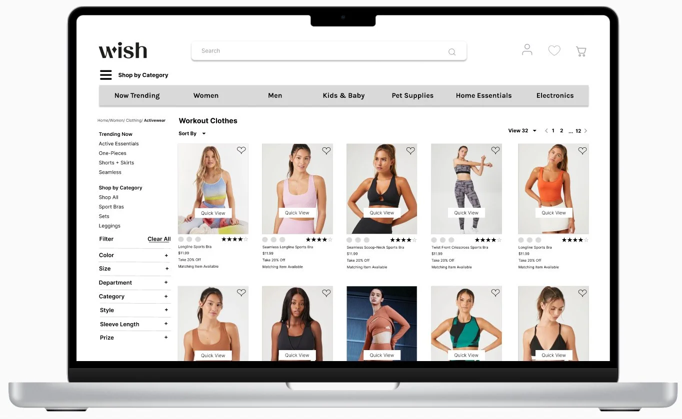
The core objective of this project is to revamp the website. This includes addressing the home page's lack of organization, simplifying search filters to enhance the user experience, streamlining the navigation menu, and creating a more user-friendly and organized presentation of related products.
Pain Points
Discover
Heuristic Evaluation
To tackle issues on the Wish.com website, I conducted a heuristic evaluation and usability test with two users. During the evaluation, I observed clutter, a confusing search function, random landing page products, and the absence of a footer. I subsequently ranked these issues and proposed improvements.
Usability Test Insights
After identifying initial pain points through heuristic evaluation, I wanted to dive deep and gather insights into the problems. I conducted two usability tests with different users to perform specific tasks on an online shopping website. Users found it frustrating and time-consuming due to cluttered product listings and lengthy descriptions. They didn't consider the site user-friendly and thought the purchase process was excessively lengthy.
"The disorganized home page with randomly displayed products overwhelmed the user."
"Recommend centralizing and auto-clearing the search field for better visibility."
"Frustration in removing wishlist items due to the single-click deselect feature."
"Simplify navigation, labels, and improve information architecture for improved browsing and discovery."
"Lack of product names while scrolling on the homepage is a significant drawback."
"Cluttered and overwhelming related product section with random displays."
"User icon menu absence on the add-to-cart page is frustrating."
User Research
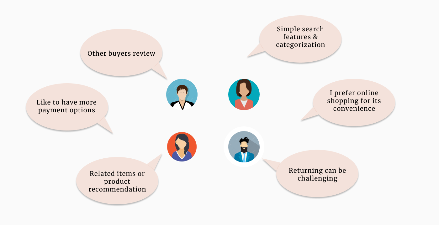
After identifying initial pain points from the evaluation, I conducted in-depth interviews to gain valuable insights into user perspectives, needs, and challenges related to wish.com. I interviewed four individuals about their online shopping experiences, collected extensive data, grouped similar responses, identified patterns, and captured user insights, ultimately revealing new information and connections.
What I wanted to uncover:
Tell me about your most recent online shopping experience and how it went?
Tell me about your recent online shopping difficulties?
What online shopping features do you find most appealing, and what's the reason behind your preference?
How likely are you to engage in online shopping?
Given wish.com's prominent market position, Competitive and Comparative analysis gained significant strength. I needed to assess companies dealing with specific scenarios within particular interactions, leading to a continuous refinement of my C&C approach in response to evolving challenges. While addressing these new issues, I consistently examined other companies and their strategies, including a comprehensive comparison of five trending online shopping websites with wish.com, with a specific emphasis on their unique features and navigation methods.
Comparative & Competitive
Analysis
After collecting user insights, I initiated a competitive analysis in which I conducted a market assessment, comparing wish.com's current website with five indirect competitors.
Define
Synthesizing the research
Key Insights
I conducting interviews with four volunteers, I employed affinity mapping to consolidate the research findings. This process helped me categorize data points into actionable insights, enabling me to identify and pinpoint the underlying issues that need resolution.
“I prefer online shopping because it offers a wider range of products compared to physical stores.”
User Persona
Card Sorting Insights
Participants could not find a home for “Detergent” so gave a separate category.
Users had different mental models for categorization, by identifying common patterns.
“I prefer when the website offers multiple secure payment options.”
“I value product descriptions that provide clear and accurate information about the product.”
“I feel overwhelmed to navigate through cluttered and confusing website layouts.”
“I appreciate having advanced filtering options.”
“I appreciate personalized product recommendations that are based on my browsing history and preferences.”
To identify user pain points and frustrations, I developed a persona to gain deeper insights into the specific user I aimed to assist, enabling a better understanding of their challenges and problems through research to clarify their needs and difficulties.
Solution
Statement
Users tend to group similar products together based on their functionality, such as women, men, kids clothings, etc.
Redesign and simplify the website layouts and improve navigation by streamlining the information architecture, decluttering the interface, and implementing clear and intuitive navigation menus and search functionality. This will alleviate the sense of overwhelm for Samuel, allowing him to easily locate relevant sections, products, and features. By creating a seamless and efficient browsing experience, the main aim is to enhance Samuel's overall satisfaction and engagement with the website.
Site Map Insights
In order to comprehend users' preferences regarding website navigation and flow, I engaged three users in a card sorting exercise. This activity assisted in constructing the website's sitemap, adhering to Miller's law in UX design to structure and organize various categories and functions.
I created the sitemap and global navigation for the 'Wish' e-commerce website to assist users in problem-solving. Through a card sorting process, I established the information architecture and sitemap to enhance user navigation on the 'Wish' website.
Following the heuristic evaluation and usability test, I moved on to crafting a user journey map by assigning a task to a user and observing their interactions with the current wish.com website.
Journey Map
Problem
Statement
Betty feels the cluttered and confusing website layouts create a sense of overwhelm, making it difficult for him to locate relevant sections, products, or features, leading to a frustrating and time-consuming browsing experience.
Design
User Flow
After completing the sitemap, I proceeded to work on the user flow, which involved the process of ordering a specific product. The flow began with a product search and concluded with the checkout process. Developing this user flow aided in prioritizing and structuring the screens required for users to successfully purchase a product from the 'Wish' online shopping website.
Ideating
Sketches to Wireframes
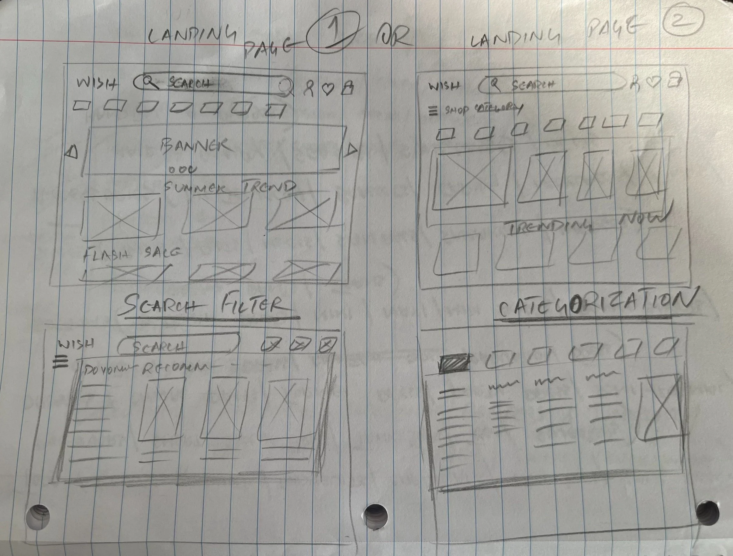
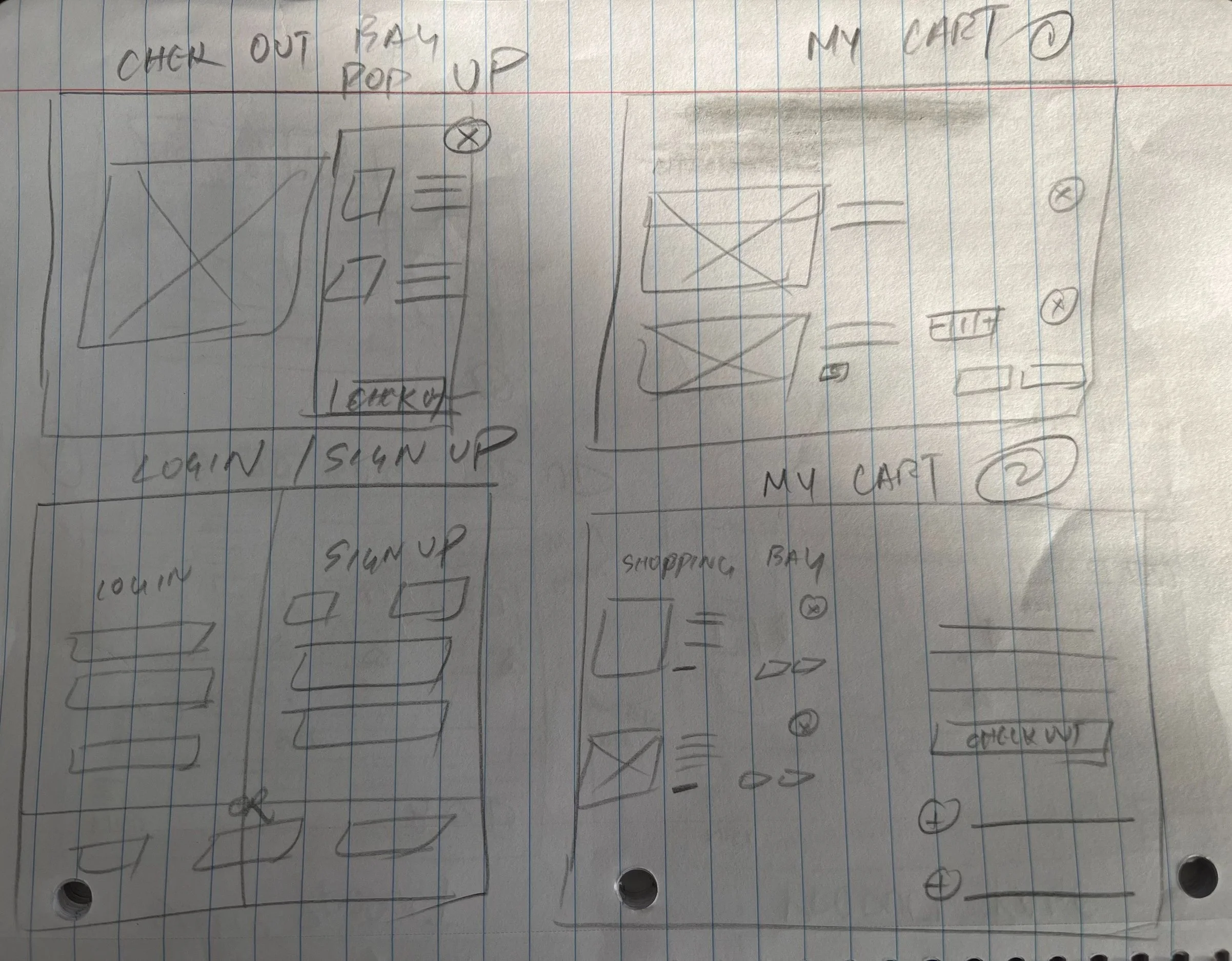
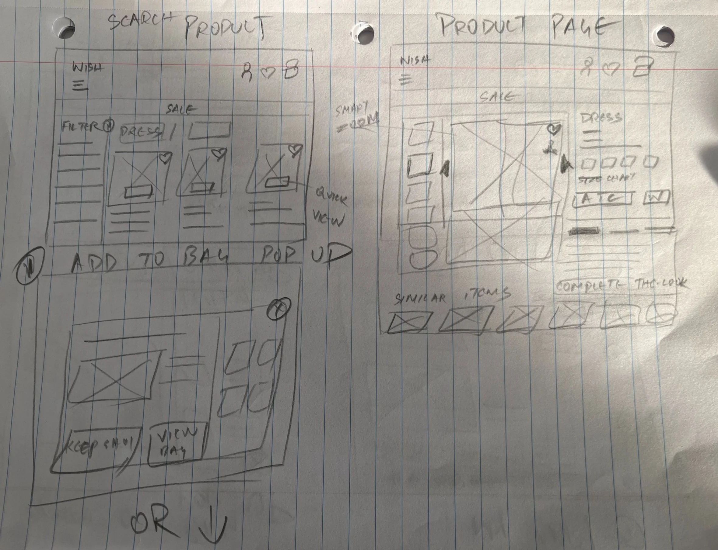
Using the user flow I developed as a basis, I rapidly sketched several screens to gain a better understanding of their appearance and the interactions they would present. Sketching allowed me to visualize the solution's flow and make necessary adjustments. As I shifted towards creating visual representations of the solution, I facilitated a design studio session to gather and refine my ideas, particularly focusing on elements I identified as valuable and efficient.
Low-Fidelity Wireframe
Deliver
Mid Fidelity
Wireframe
Process from Low Fidelity to Mid Fidelity
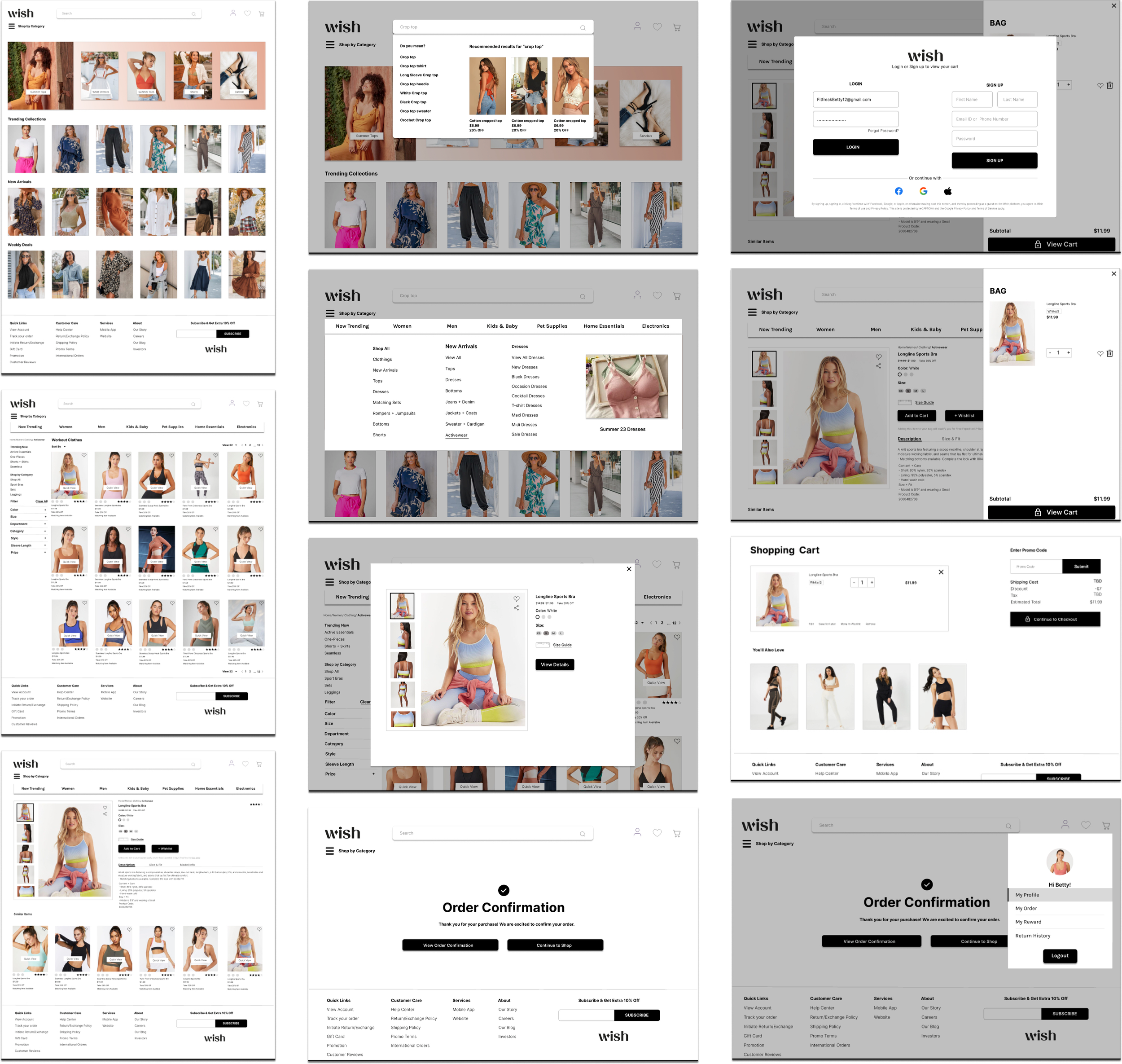
I transformed the low-fidelity wireframe into a mid-fidelity wireframe using the valuable user insights.
High Fidelity
Wireframe
Process from Mid Fidelity to High Fidelity
I transformed the mid-fidelity wireframe into a high-fidelity wireframe using the valuable user insights.
Next Steps
Perform supplementary usability tests and refine the design accordingly.
Enhance the web's UI design.
Create a dedicated page for customer feedback.
Improve the 'Add to Wishlist' and 'Remove from Wishlist' functionality.
Enhance the sign-up page, including social media sign-up options.
Add interactivity to the website.
Next case study


