Overview
The goal is to redesign the ‘Parting out’ website for users to understand the platform enough to seamlessly complete a deal with the seller for their desired part using Parting Out.
Rapid Prototype
Pain Points
Discover
Heuristic Evaluation
After recognizing the issues presented by the parting-out website, our decision was to perform a heuristic evaluation along with an initial usability test that included three individuals. This approach aimed to simulate the user journey and pinpoint specific areas of the website that did not meet expectations.
Usability Test Insights
Once we had a general idea about the pain points from the heuristic evaluation, we wanted to dive deep and gather insights into the problems. Usability test interviews with the current website provided valuable insights into user perspectives, needs and challenges related to parting out.
Users mistakenly believed they had to buy the entire car and struggled to locate specific parts like the radio.
Users found the term 'parting out' confusing and weren't sure what it meant.
Users didn't understand the distinction between the 'make offer' and 'quick offer' options.
Users expressed uncertainty about how to indicate the condition of the item they were interested in.
Users were unfamiliar with the term 'decode' and couldn't grasp its meaning in context.
Users were unsure of the purpose and meaning of the various conditions provided.
Users found the notifications puzzling and didn't understand why they were receiving them repeatedly
Users requested more comprehensive information related to the purchasing process.
User Interview
Once we had a general idea about the pain points from the survey, we wanted dive deep and gather insights into the problems. In-depth interviews provide valuable insights into user perspectives, needs and challenges related to module housing.
What we wanted to uncover:
What about the last time you bought a used auto part?
What are some important things to know before buying a used car part?
What are some challenges that comes with buying used parts?
How often do you negotiate prices?
Due to Parting Out's role in the market, our Competitive and Comparative analysis gained remarkable strength. We had to examine companies that catered to highly specific instances within particular interactions, as there was no website precisely mirroring Parting Out's functionality. This led us to continuously develop our C&C due to emerging challenges. We also added more things to the site than we planned. So, while thinking about these new problems, we always looked at other companies and how they do things to handle these new parts.
Comparative & Competitive
Analysis
After gathering the insights on our users needs and wants, we started performing a competitive analysis. Our team conducted a market analysis comparing ‘Parting Out’ current website with the six indirect competitors.
Define
Synthesizing the research
Key Insights
Using the interviews with 13 volunteers, we used affinity mapping to synthesize the research. Affinity mapping led me to sort data points into insights and allows us to look for the problems that need to be addressed in order to solve the problem.
I want to know the condition of the item I am buying.
User Persona
I wish I knew I could trust the seller.
I want to be able to negotiate the price.
I need a more accurate sorting/filtering specifications to look for my part.
I want a convenient way to find parts quickly.
I want to be able to speak to the seller, so I know I am getting the right part for me.
We created a persona to help us understand what our users needs are. We also wanted to remind ourself of the needs, behaviors and user goals and these persona helps us to think from the users point of view.
Solution
Statement
The new Parting Out platform is focused on improving access to vintage car parts. It features a concise, human-centered onboarding experience which allows users to understand the purpose of the site, and how to use it. Additionally, the redesign includes:
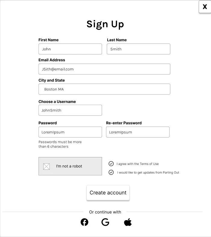
A simple, non-invasive sign-up process that doesn’t ask buyers to give their addresses.
Instructions to ensure accurate searching for the make/model/year of the car they are looking for.
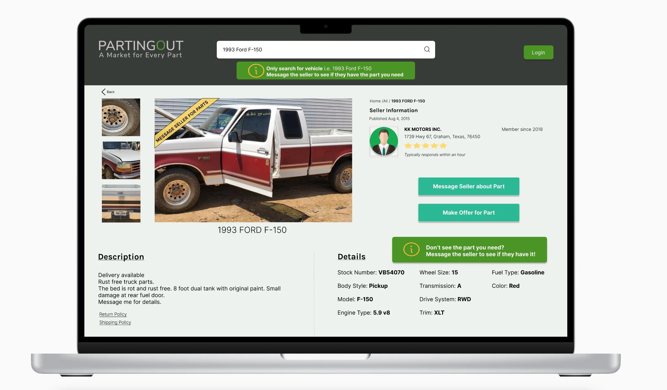
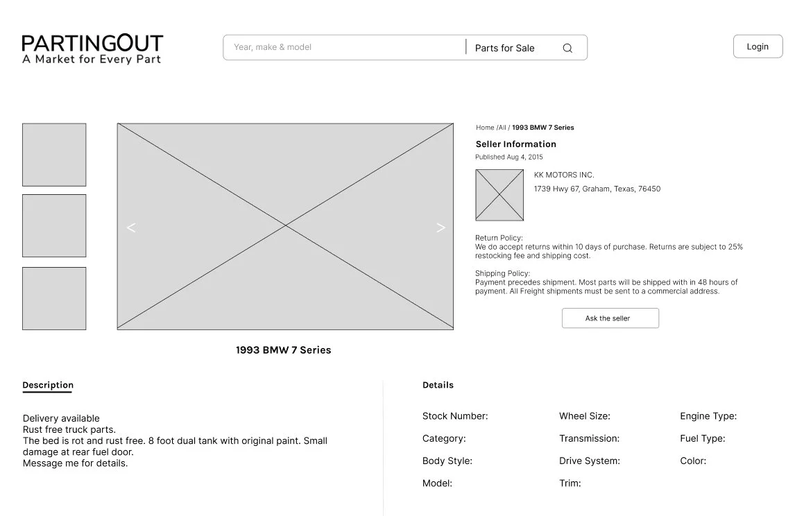
A detailed product listing page, with clear instruction on how to find what they need
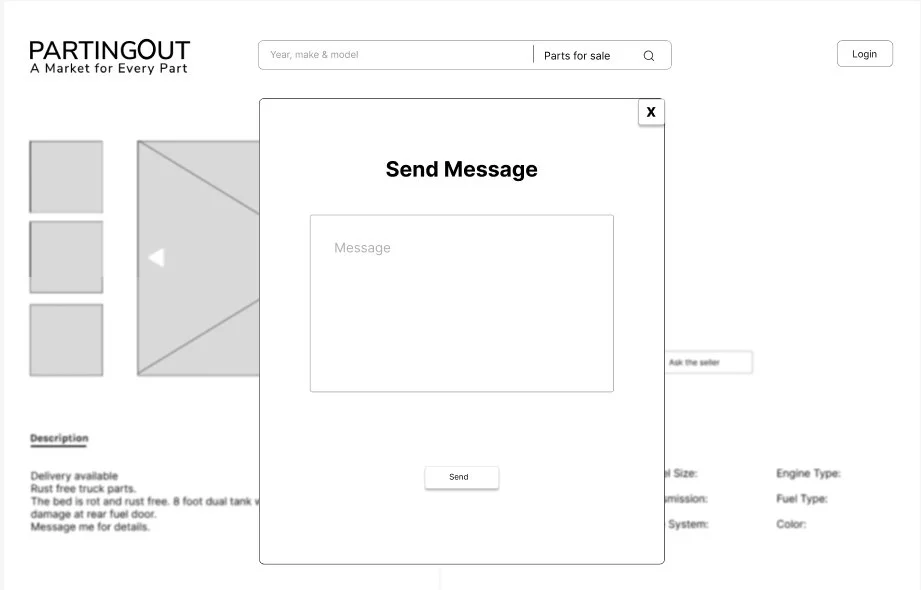
A renovated, interactive chatting feature between buyers and sellers for direct communication
A simplified purchase to offer system.
By teaching the user how to use the site, creating transparency to gain user trust, and streamlining the process of finding the right seller, part, and price, the redesign eliminates the confusion and distrust that users currently experience.
After establishing the heuristic evaluation and conducting the usability test, we proceeded to create a user journey map by assigning a task to the user and observing their interactions with the existing parting-out website.
Journey Map
Problem
Statement
Parting Out is experiencing the need for more buyers. In order to encourage engagement, users need to know that the seller is trustworthy. Currently, there is a lack of guidance on how to use the site and a lack of transparency on the part of the seller regarding pricing and availability. Without access to pertinent information, users feel frustrated and confused, and can’t make informed decisions when purchasing a part.
Design
Ideating
Sketches to Wireframes
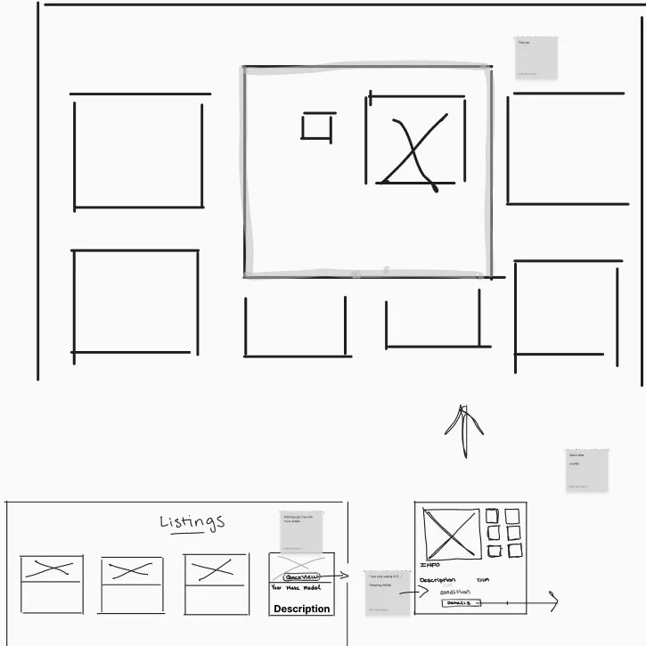
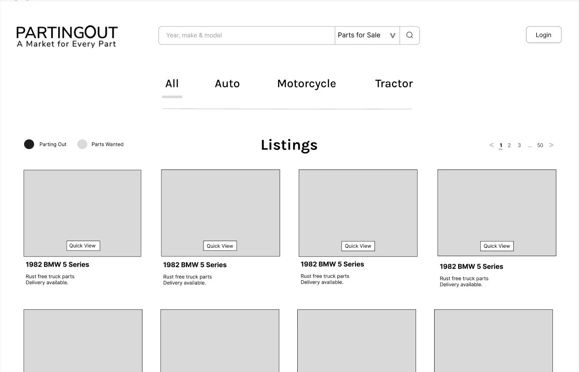
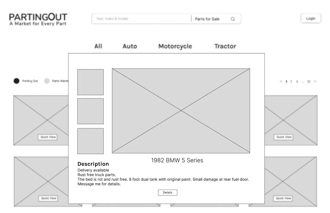
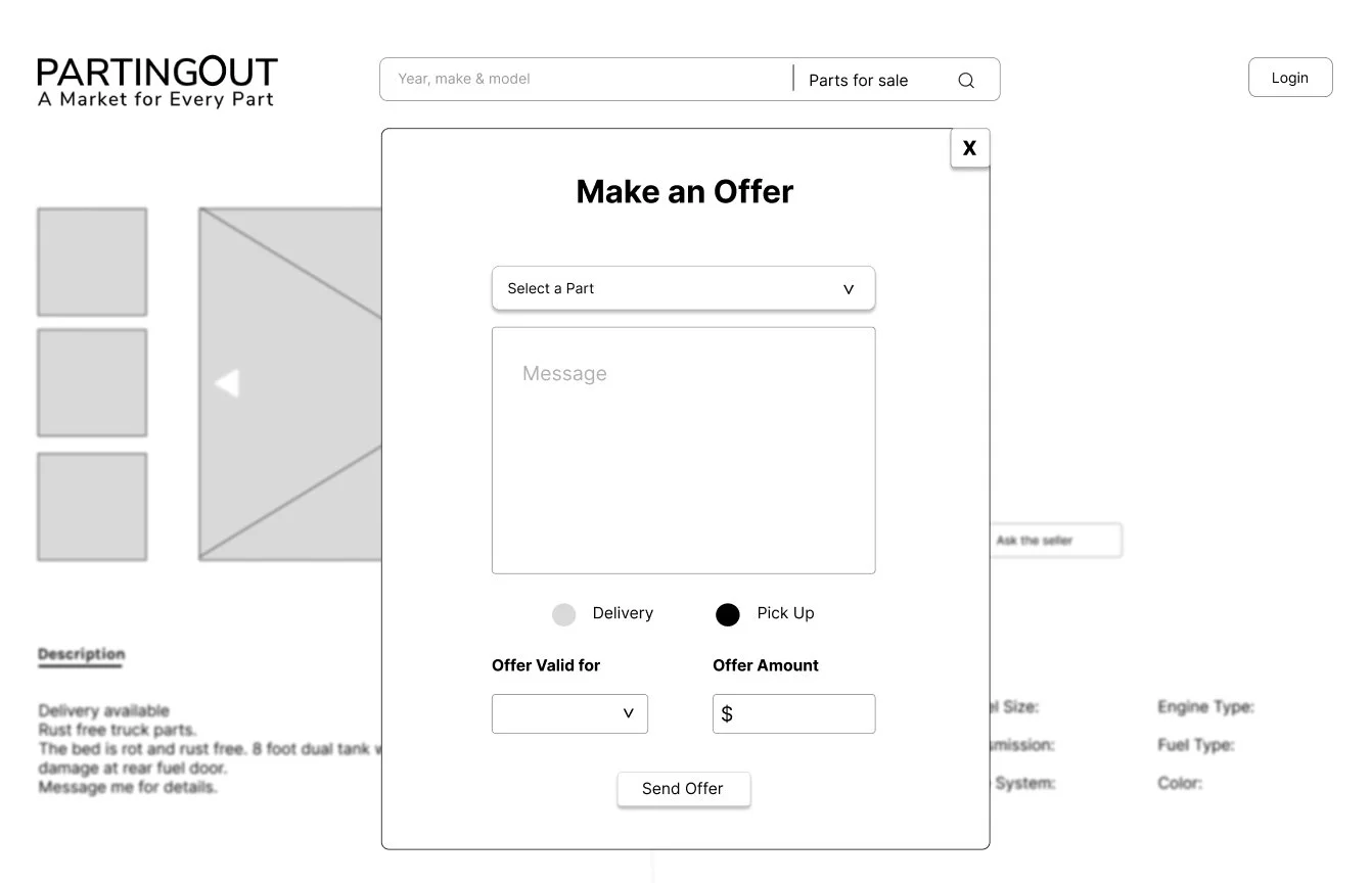
As we began transitioning towards visual representations of our solution, we organized a design studio session to consolidate all our ideas and iterate on the aspects we identified as beneficial and effective.
Low-Fidelity Wireframe
Deliver
First Prototype
Usability Test
Process from Low Fidelity to Mid Fidelity
With our first prototype we begin our first round of usability test with four different users.
Usability Test: Prompt
”Search for 1993 Ford F-150 alternator and message the seller and make an offer for $50”
User needs clear information to message the seller for parts wanted
Users are getting confused between “Parts Wanted” & “Parts for Sale”
Need clear guidance of how to navigate to the next page
User gets confused with searching parts
First Prototype
Test Results
User wants to see a picture of an alternator to make a decision
"Eliminated the "Parting Out" radio button to prevent user confusion"
Confused with the “Awaiting Offer” to the “Offer Accepted” screen ”
User gets confused on how to proceed to the next page
“I found the car but I don’t see the picture or information about the alternator”
"Side-by-side buttons let the buyer message the seller or make an instant offer."
“User was not expecting to navigate to the same page after creating an account”
“User feels confused how to navigate back to the offer page from the inbox page”
“Simplified the search filtering options to provide a more straightforward filter”
"We have revamped the 'Make an Offer' overlay to make it simpler."
"What exactly should I send the seller?"
We made several adjustments to our wireframe based on user feedback. Subsequently, we conducted another round of usability tests with five distinct users using our second prototype.
Second Prototype
Usability Test
Process from Mid Fidelity to High Fidelity
“Users were trying to search the parts wanted on the search bar”
Usability Test: Prompt
”Search for 1993 Ford F-150 alternator and message the seller and make an offer for $50”
“User is confused whether to message the seller or make an offer”
“User feels that the background looks too plain and white”
Second Prototype
Test Results
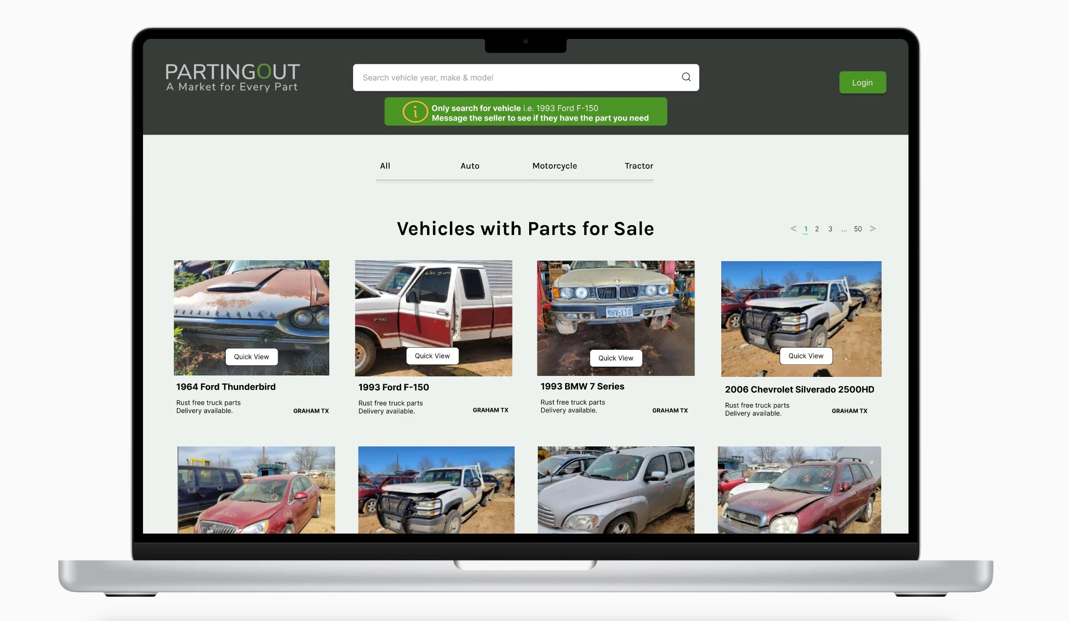
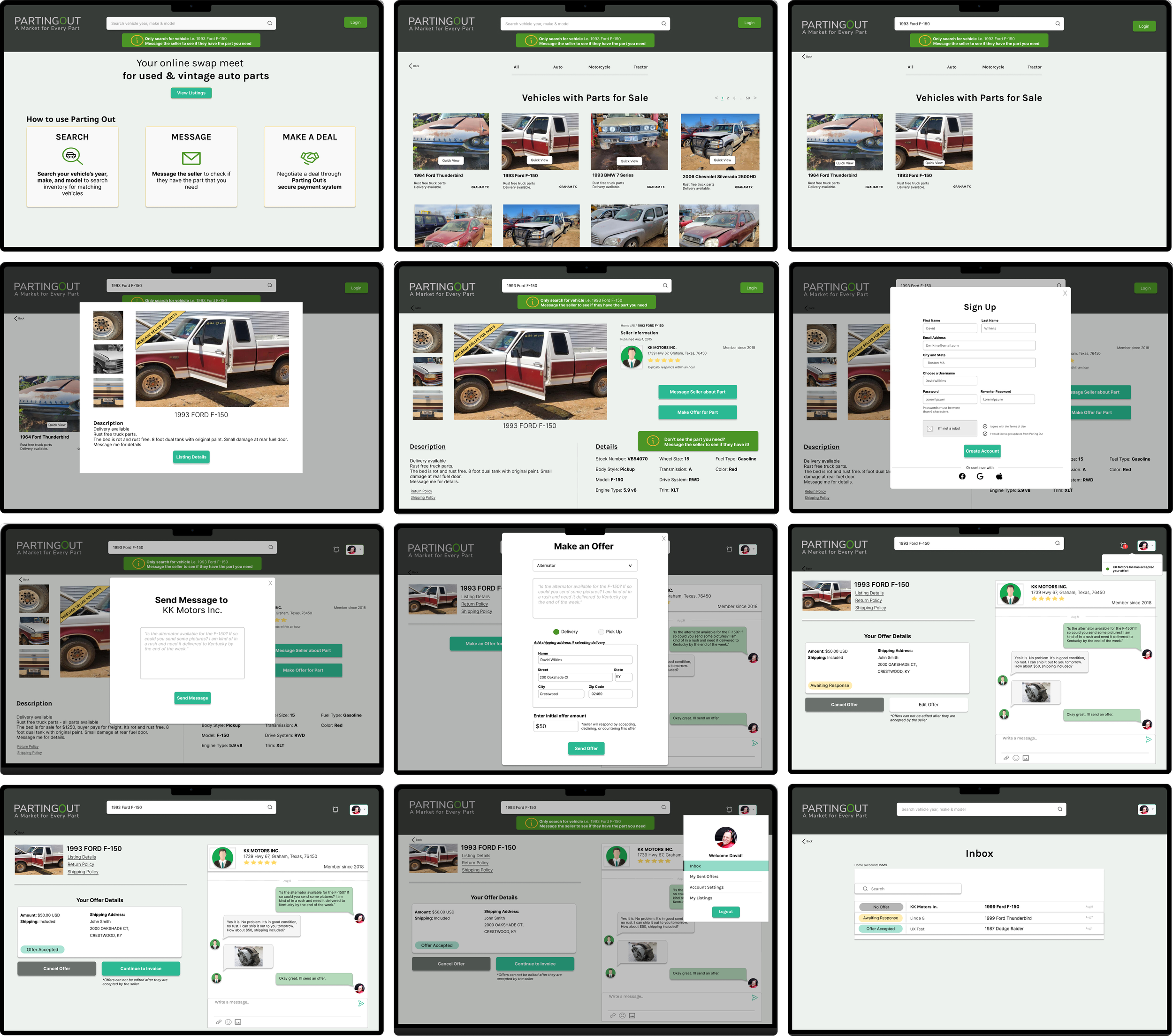
Enhancing the landing page to make it more vibrant and rich with useful information for the user
Improving the chat box for the buyer and seller includes sharing pictures of the wanted parts.
Design System
Style Guide
Final Prototype
High-Fidelity Screens
“User cannot find the image of an alternator”
“User is confused in the make an offer page”
“User feel it would be helpful if a pop-up automatically appeared while waiting for the seller's response.”
Crafting a toaster notification proved to be beneficial for the users.
Modified the UX context of the button to enhance user comprehension.
Adding a notification pop-up that emerges when the buyer receives a message or when an offer is accepted, declined or countered.
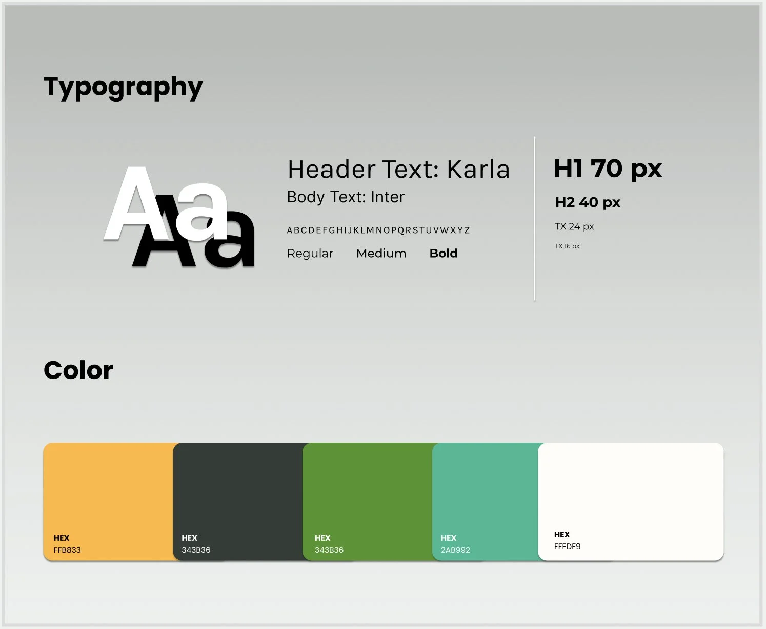
We aimed to display a sense of simplicity, vibrancy, and opulence. As a result, we opted for colors sourced from the parting out website.
Next Steps
Sorting of listings should be organized and consistent. Currently, the listings mix at each visit to the page, even when the back button is used.
Accurate and explicit warranties included in the invoice.
Taxes calculated in the invoice.
Eliminate Parts Wanted listings and replace with a forum for buyers to connect with sellers, so buyers can post what they are looking for if their car is not listed.
Next case study


