Overview
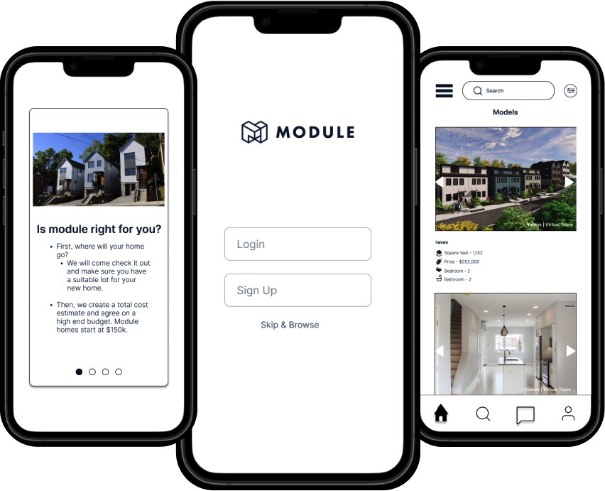
The goal of the project is to develop an app that enhances the experience for potential and current homebuyers of module housing by providing detailed information, tracking features and interactive capabilities. Module housing aim is to create an app and attract new homebuyers to showcase the company’s work.
Discover
User Research
We conducted in-depth research, including a screen survey among our classmates and friends who have purchased or are interested in buying a home, to uncover problems and real user needs.
"Even starter homes are way out of most peoples price range."
"My main concerns are quality of construction, timeline for construction and option for customization"
Customization
Build user confidence
Texting updates
Usability Test
Insights
"housing market is impossible for first time home buyers."
Comparative & Competitive
Analysis
"My main concerns are quality of construction, timeline for construction and option for customization"
In-Depth
Interviews
Once we had a general idea about the pain points from the survey, we wanted dive deep and gather insights into the problems. In-depth interviews provide valuable insights into user perspectives, needs and challenges related to module housing.
Users feelings when buying a home
"Buying a house is crazy right now."
"Want some type of update
"I question the longevity of modular homes"
"Is it all built in the factory?
Do you currently rent or own where you are living?
"Houses are too expensive with the current market rate"
Good filters and browsing to try emulating
Screener Survey
Interview Quotes
“I like uniqueness in house, it brings character
“ Building a custom home can be challenging”
"(…) skeptical about manufactured homes"
After gathering the insights on our users needs and wants, we started performing a competitive analysis. Our team conducted a market analysis comparing ‘Module Housing’ with the four indirect competitors.
Does a much better job at informing users what they do than module
Our team conducted a usability test of the current module housing website with two users, which helped us to gather user feedback and recommend improvement for our mobile application.
Much more clear CTA
Does a better job explaining what is modular
"sounds weird"
"how do they get it there?"
"Manufactured homes don’t hold value as well."
We conducted a screen survey to delve into the needs and preferences of individuals who have either purchased a home or expressed interest in buying a home. The survey aimed to provide a comprehensive understanding of the challenges and requirements users face when making such a significant decision.
Have you ever considered buying a home?
Define
Synthesizing the research
Key Insights
Using the interviews with 12 volunteers, we used affinity mapping to synthesize the research. Affinity mapping led me to sort data points into insights and allows us to look for the problems that need to be addressed in order to solve the problem.
I value understanding the affordability
I value customization
I value a safe and durable home
Problem
Statement
Users need a better way to feel confident purchasing a new home because the process currently lacks transparency about all the costs involved, about the quality of the construction, the materials of the actual home, about what the home will look like once built, and lacks regular updates about the status of the construction of the home.
Solution
Statement
Meet Vicky Bala
Persona
I value delivery updates- build confidence/excitement
I value understanding how my house is being built
To design a user-friendly mobile app that informs and reassures the user throughout the onboarding experience. The app will be concise and visual with photos of the Module process, a clear breakdown of total costs, and thoughtful progress updates and tracking notifications for buyers. Ultimately the app will empower users to trust Module and feel confident in their understanding and its benefits.
We created a persona to help us understand what our users needs are. We also wanted to remind ourself of the needs, behaviors and user goals and these persona helps us to think from the users point of view.
Journey Map
After defining the persona, we developed a customer journey map by simply giving a task to the user and how they were interacting.
Design
MoSCow
Ideation
Based on our research method, we narrowed down the ideas to focus on the must-haves to make the biggest impact for home buying users.
Inform users of cost
Assure quality of construction
Reviews
Informing buyers about process & benefits
Journey map of construction
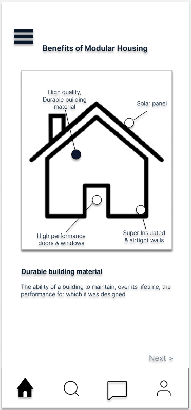
Detailed specifics of benefits
M(Must)
C(Could)
Chat feature
Give buyers zoom link to contact developers
With our problem identified, we dived into ideation. We wanted to develop an mobile application that informs and reassures home buyers during a home buying process.
Mid-Fidelity Wireframe
S(Should)
Quality of construction
Materials used
Virtual tour
Tracking features
W(Won’t)
High quality rendering
3D model of house
User meeting designer virtually/ face-to-face
Ideating
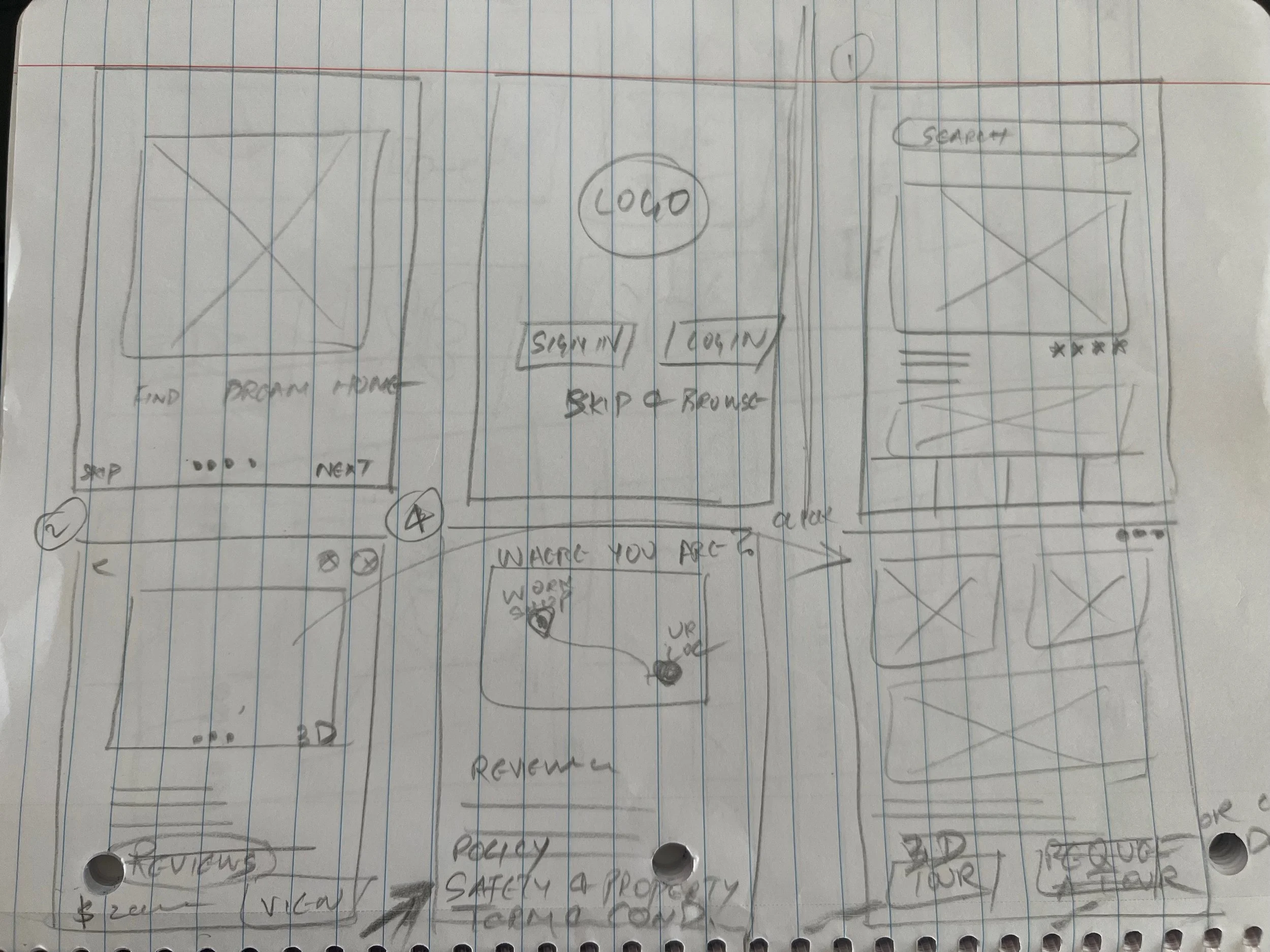
Sketches and Wire-Framing
Deliver
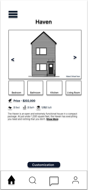
First Prototype
Usability Test
With our first prototype we begin our first round of usability test with one of the user.
"I want the option to browse houses right away."
"I want to see pictures of it built"
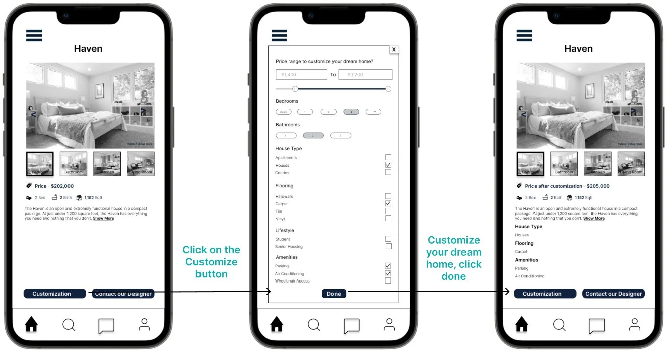
"I wish I could press the customization button."
"If I think they are ugly I wouldn't be interested in learning more"
First Prototype
Test Results
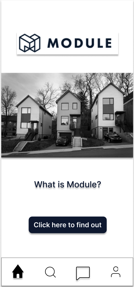
Module home
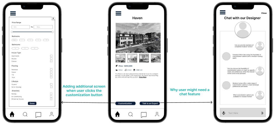
Second Prototype
Usability Test
"What is the chat feature for?"
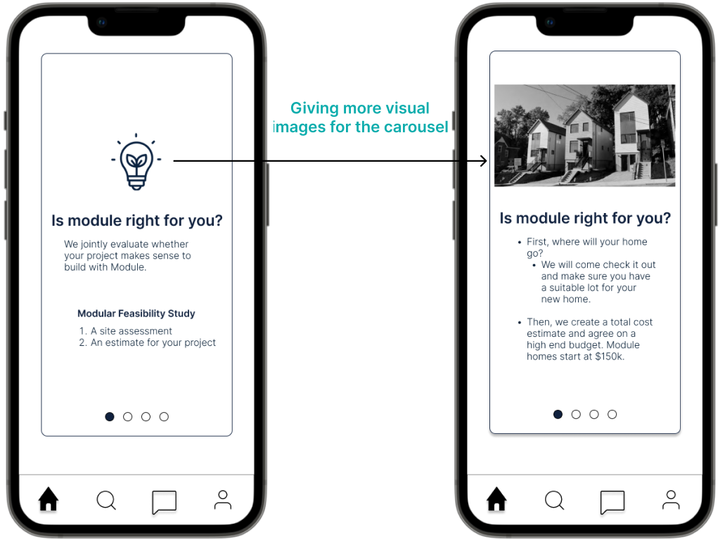
"I want to see visual images of the house"
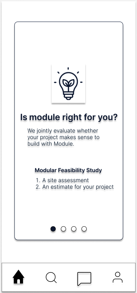
“(…) feasibility analysis, more cost info want to see actual examples”
I would definitely want to customize the home and check the cost of the customization.
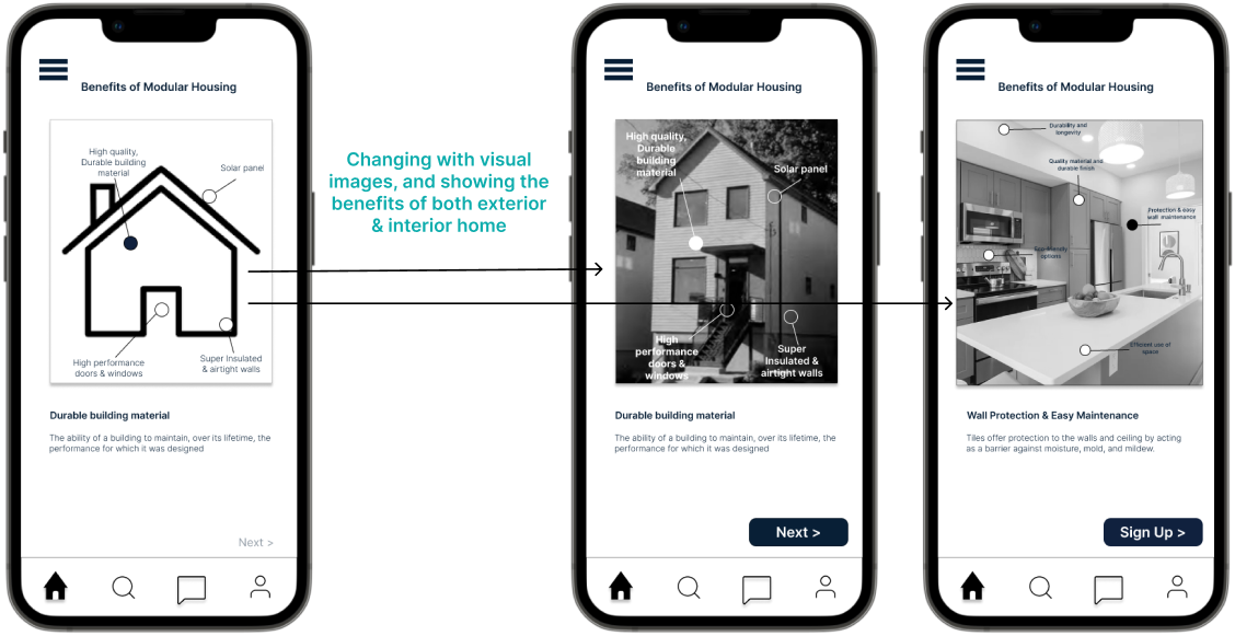
User would feel more comfortable to see actual home images, so we replaced it with both exterior and interior image.
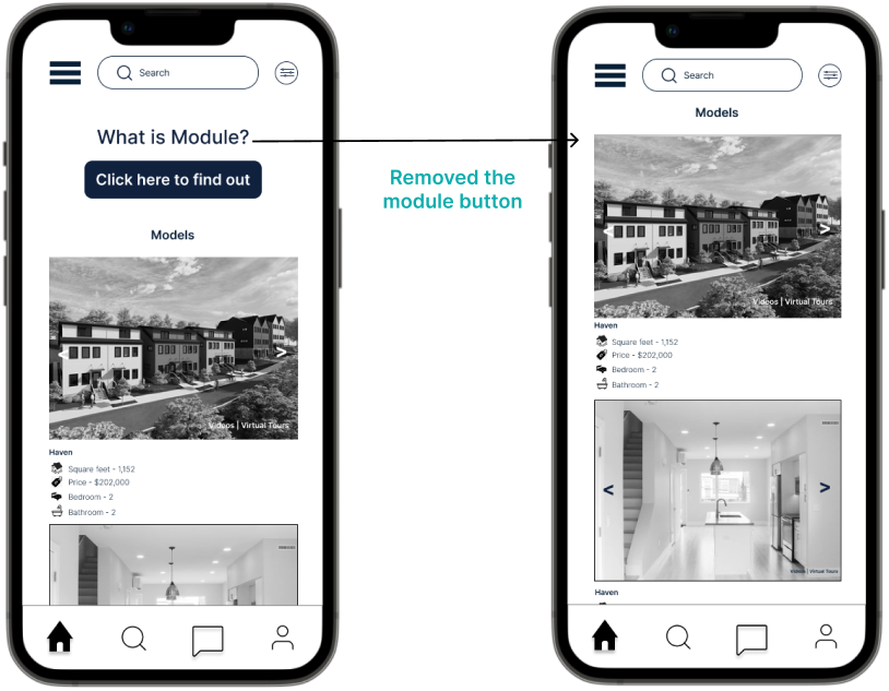
User feels that’s an unnecessary button on the home page.
Home Page
Customize your home
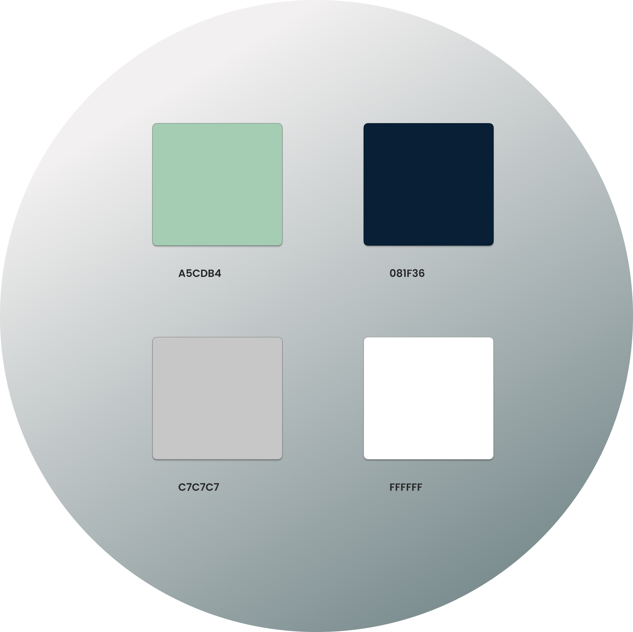
We wanted to showcase a simple, elegant and a positive feeling. So we chose colors from the module housing website.
Home info page
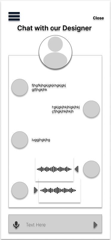
How to contact a designer
We did few changes with our wireframe with the user feedback. And with our second prototype we conducted next round of usability test with one of the user.
“ Would like to know what module home is in more Humanized language”
Pictures build trust and understanding
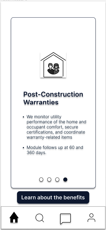
"Everyone is going to want to learn more…carousel should be first... not hidden"
Focus on onboarding of a new user receiving info on module and then signing up
Second Prototype
Test Results
Style Guide
Color Palette
Final Prototype
Hi-Fi Screens
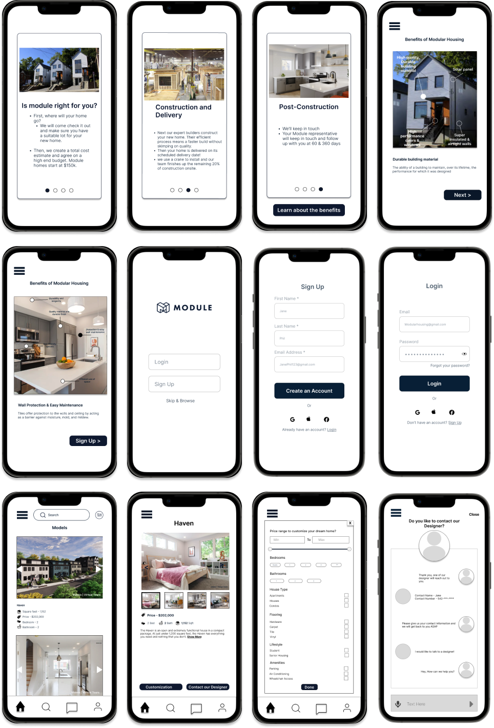
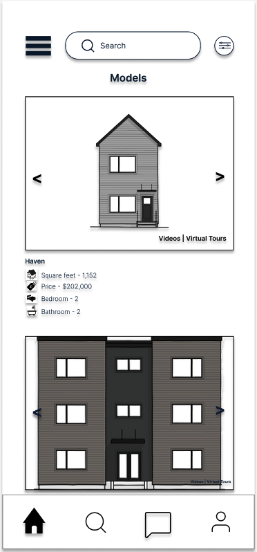
User wants to browse through the houses on the home page once they open the app.
"Don't want to feel like I'm the first person to purchase a Modular home"
Chat with designer, not talk to an expert
I created a login and sign up page with the additional of ‘skip & browse’
"I would want to talk on the phone for such a large purchase"
The icons were confusing for the user, so we replaced it with the visual image.
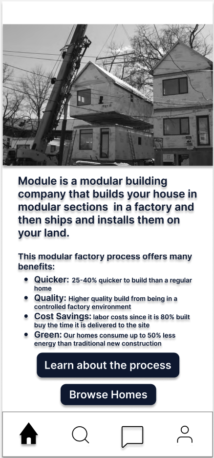
Changed it to more human language for the home buyers to understand the process.
The icons are confusing, would like to see pictures instead of icons
User wants to customize, and wants to check the cost after customization
This is my most favorite part in the design process. After the usability testing, our next step were to refine the UX and UI based on the feedback from our users and adding colors to the wireframes. Once the hi-fidelity wireframes are completed, I performed a round of prototype test to make sure the app is intuitive and easy to use for the users.
Next Step
Usability test to check effectiveness of updates, how clearly users understand
Build out financial details page
Make tracking feature
Integrate virtual tour function
Next case study


